Beyond centering
There is so much more that goes into building web interfaces than just centering. In a vacuum centering is easy. But in the context of a big code base using different techniques to achieve the same result ends up with a mess of hard-to-maintain code.Imagine you are working for Facebook and is tasked to build this interface:
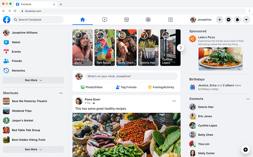
There are thousands way to go about it. Over the 15 years of my career I've found the best way to do it is to see everything as rows and columns:
Two rows.
Let's keep on splitting things up:
Three columns.
We can keep doing this until we got all areas covered.
My point here is that every design can be split into these areas, and all these areas can be build using our established rows and columns.
This is how it would look:
Search
Navigation
User
Actions
Main content
Contacts
I intentionally left out styling for background color and height of the inner children to get the point across without all the noise.
Looks nice and tidy right?
Building things this way speeds up the process a lot while also guaranteeing consistency across the code base.